Postcard Number One: Here
My first edition of postcard featuring my own photograph has finally been printed and delivered to me (again)! The photograph is named “Here” and this postcard series is in the same name. So far there exists two revisions of it: A and B. Both feature the same photograph but have different designs.
This article explains the postcard’s design and background. You could be on this page because you scanned the QR code or visited the link on the back of the postcard you received. Or you might just wandered in. No matter how you end up being on this page, carry on reading if you’re interested!
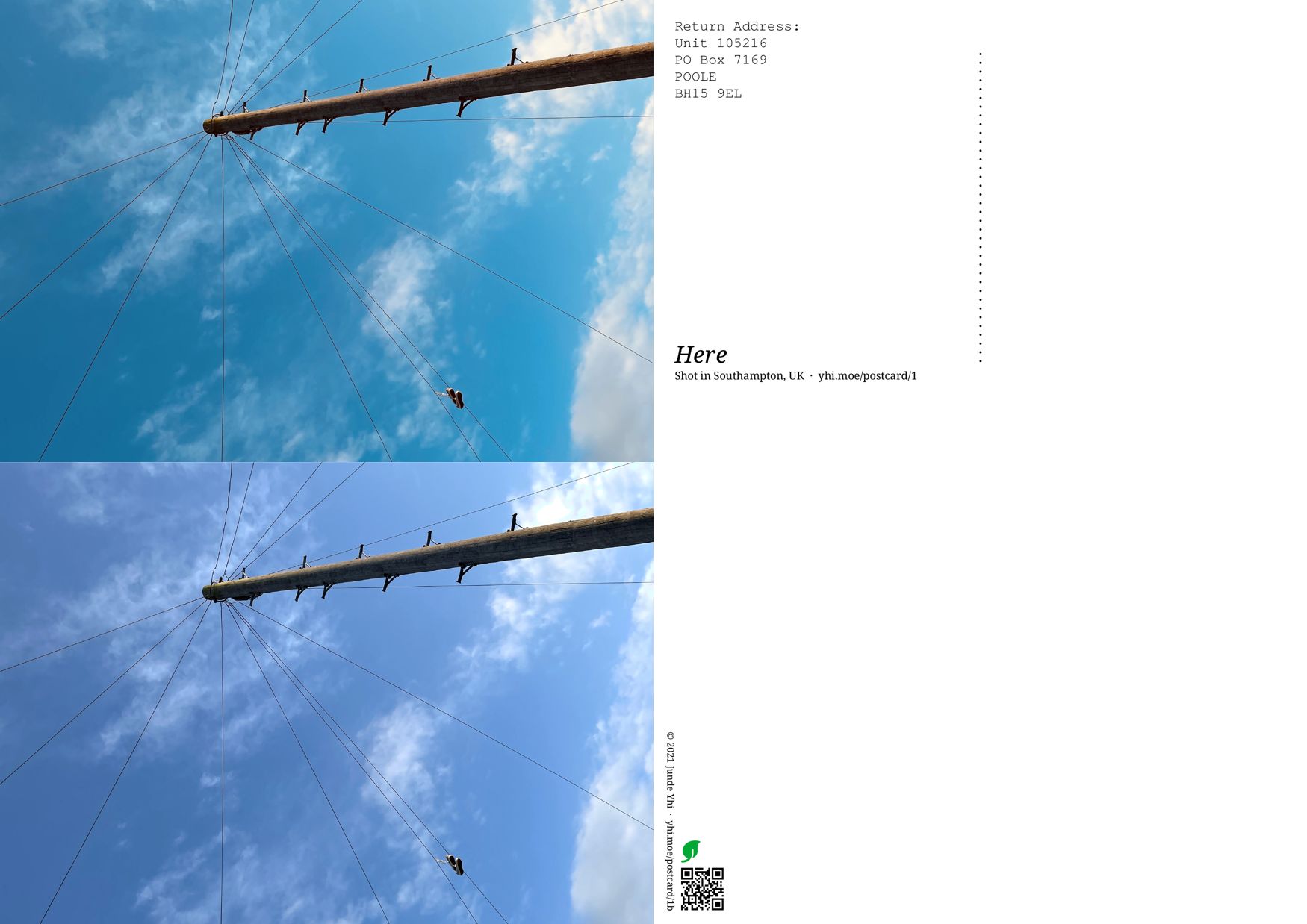
The two revisions of postcard are shown below. The top row contains the two sides of a revision A postcard. The bottom row contains the two sides of a revision B postcard.
The Photograph
The photograph captures a pair of shoes being hung on an overhead power line, with a blue sky and scattered clouds as the background. A corner of a house is also in the picture.
Apple iPhone 12 mini was used to take this photo. ISO 32, aperture size f1.6, shutter speed 1/1553s.
When I took this photo, I had no idea what does this mean. I thought that it might be some sort of subculture that I didn’t know about. Until the moment when I selected this photograph to print on postcards did I go online and searched for the meaning of “shoe tossing”. Multiple different meanings exist – drug sale, celebration, … However, they share a common trait: signifying the current place. Something could happen, or could’ve happened around the place where someone threw a pair of shoes onto the power line. Like a visual beacon, or a map pin in real life. As a result, I named this photograph as “Here”. It’s this very location that matters; or maybe.
GPS location wasn’t saved in the metadata, so I have no idea where exactly this place is. All I know is that this photograph was captured on our way home after collecting some second-hand goods with H.
Overhead power lines (of course some of them may be communication cables) in the United Kingdom doesn’t look organized at all. Houses around a wire pole are simply connected to it on their shortest paths, so most often streets in the UK have radial overhead cables all around. The wire poles are often wooden; we don’t even know how long they’ve been standing at there.
The Postcard
The postcard has a standard size of A6 (148mm × 105mm). The front contains only the photograph, but cropped and placed in a portrait position. The back is prepared for writing.
The first revision (revision A) contains elements that was thought to be on every postcard: a block of return address, the title of photograph, “Shot in Southampton, UK”, a Web link (which redirects you to here if you visit), and a vertical dotted line is placed in the middle to separate the messaging area and the addressing area. The bottom of the back also has 18mm of space specifically reserved for a USPS postal barcode. The return address doesn’t contain the country name, but I once received a returned nixie from USA, so it should be fine.
The second revision (revision B) removes most elements on the back, as in practice some of them will be in the way if a card is not used as a postcard. This revision has a fully portrait design, but also gives enough consideration about landscape use, which is more common. A QR code containing a link to this page, a green leaf logo (see its meaning below) and a short notation are added to the bottom-right corner (or bottom-left corder, depending on what orientation is a card written with). When placed in landscape, the height of both the QR code and the green leaf logo roughly guides the margin that should be reserved for a USPS postal barcode.
The photograph printed on revision A was conditioned with filter “Vivid Warm” in iOS Photos App. While it looks great on screens, on paper the color somehow becomes pretty strange. As a result, the photograph on revision B was only slightly adjusted with the “Auto Contrast” filter in Krita. Both revisions are designed with LibreOffice Draw.
In total, 50 revision A and 100 revision B postcards are printed with Solopress Eco-Friendly Postcards, which should be “100% recycled and carbon neutral”. This is why revision B postcards have a green leaf logo.
The Photograph
You can download the photograph in its original format, HEVC/HEIF (HEIC) by visiting this link.
Photograph Copyright © 2021 Junde Yhi. This work is licensed under Creative Commons Attribution-ShareAlike 4.0 International. To view a copy of this license, visit https://creativecommons.org/licenses/by-sa/4.0/. You should follow the terms in the license if you use the photograph somewhere else.